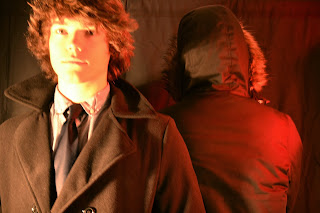
In order to present our idea to our teacher we needed a poster therefore i tried out some different styles of posters that i can do. I knew what i wanted it to look like but capturing an image how i wanted in the light i wanted seemed to be difficult. Im pleased with the outcome and the final poster will obviously have a lot more text and information on it. But the image at the moment is probably going to be similar to the one used here. The models in the poster are also not the people who will be playing the part and but the positioning is the same. The next important thing to do is casting so we can strat properly planning the magazine and poster along with handing out the scripts for them to look over.
The editing i did on photoshop revolved a lot around the adjustment layers and altering curves. The original image was very bright on the face so i wanted this to be dimmed. I also wanted the shadow to kind of look like a shadow so it leaves people guessing if thats another person or himself. Been as our film is about time travel i wanted there to be questions asked about the film poster and for the main character to be clearly shown and the 'time traveler' to be hidden. We tried taking the photos in different places we bagan from doing it a studio with the proper loghting allthough this didnt give the lighting effect i wanted iot was too harsh and looked very faulse therefore we tried outside which meant the light was very different and natural. This was still to harsh so by using a brick wall it gave a darker background. As i wanted the image to look as if it was at night i created this effect in photoshop.
Non edited images from the shoot:


No comments:
Post a Comment